PostUp
swipe for your ideal work place

Timeline
-
April 11 ~ April 15 (5 days)
Tool
-
Figma, FigJam
Role
-
Solo self-guided Design Sprint
-
Scope the problem, create an End-to-end user experience map, a Lightning Demo and Storyboard, design prototypes, and test the UX usability
Background
PostUp wants to help remote workers find places to work by providing a directory of public places that already exist.
Design Constraints
-
Your solution should be designed as a mobile app
-
PostUP wants to help users find place that already exist
-
PostUp wants to charge a monthly fee to users in exchanges for access to PostUP information
Problem
Time-consuming + too much useless information
As a remote student, I find that a better workplace will improve working efficiency. But before focusing on the work, I put much effort into looking places, switching apps from google maps to yelp (or more) back and forth several times. I was exhausted. Ironically, finding the perfect place for better work efficiency was wasted my time.
Solution
Swipe! Make the Decision Faster!
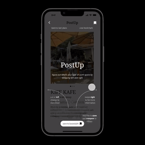
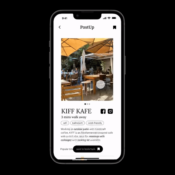
Swipe left for the Next location; swipe right for More Information. With an extensive photo gallery and limited but necessary information provided, PostUp created an opportunity to invite users to make faster decisions. The main page will only present one location at a time, which starts a yes or no situation. Once you swipe left, PostUp will provide the other location near you. Once you swipe right, PostUp will give you more information than you need, such as popular time, Google reviews, and even directly navigate you to the location with Google Map.
Minimal but informational
You can quickly identify whether the place meets your need, thanks to “tags.” Tags can be amenities, ambiance, menu, or location. You quickly scan through the intro and decide in seconds.
Quick
Taking inspiration from Tinder — the fast-paced dating app, PostUp will provide the quickest decision-making experience to match your needs. By swiping left and right, you can decide whether you would love to learn more about the place or not.
All in One
After you make your decision, more information will reveal. The Busy Time can help you better understand the crowdedness. The curated Top Review saves you time jumping around apps to find the related reviews. And Navigation can direct you to the place in one click.

Save and compare
If you are not sure about the location, and want to browse more sites, you can save the place first, and compare your other saved location later on by Google Review, distance, missing tags...etc.
Initial Steps
Looking for apps that make a quick decision
End-to-end user experience map

By creating the user experience map, it will help me set the blueprint of the project.
Lighting demo

I first wondered in what situations I will make a quick decision. Tinder came into my mind. And I also thought of Google maps, it has the most information that I need when I am looking for a place to study. Then I analyzed both UI designs and how may they help me create a meaningful app, and took inspiration from them.
Crazy 8s exercise

During this exercise, I figured out the most critical screen is the profile page for places, because it is the most important action that makes this app functional.
Ways to solution
Tinder mode + Google Map
Solution Sketch

With the combination of Fast Decision making — Tinder, and Informational Map Navigation — Google, PoshUP will help you filter your perfect place to work and also help you get there within one app!
Storyboard

Creating the storyboard gave me a better idea of how I can utilize the strategy of "making faster decision" by adding different level of features and helped users to make the decision faster.
Research Insights — provided by the brief
Wifi + Bathroom + Outlet (less noise) = Perfect!
-
“Wifi is definitely the most important thing for me...if I don’t have to buy something to get a password, that’s even better.” — Maria
-
“I usually need to jump on the computer for a video chat- so. I need to make sure that WiFi is good, and that there isn’t too much background noise.” — Andy
-
“I definitely look for places that aren’t too crowded, especially if I’m trying to get a lot of work done in a short amount of time.” — Evelyn
More insight
-
“WiFi and bathroom are the most important thing I look for, especially if I plan on working there for a full day.” — Jane
-
“I like to know how crowded a place is- if I’m doing independent work, I don’t want it to be super loud. If i’m meeting clients or coworkers there, I want to be sure we can get a place to sit and talk for a bit” — James
-
“If a place has WiFi, outlets, and bathrooms- that’s all I need. If I need to buy some food or coffee to stay there, I really don’t mind. Bonus points if their coffee and food are actually good.” — Claire
-
“I know a lot of places to go near me, but I’m often in other parts of the city and need a place nearby to post up for an hour or two between meetings.” — Rhonda
-
“I like to find places where other people go to work - they’re usually more friendly towards me setting up my laptop and working. I like places that are used to people working there - I don’t have to get nervous that I’ll be asked to leave while I’m in the middle of my work.” — Beth
-
“I usually look at pictures of the place before I go, just to make sure there’s enough room for me and my coworker to take a table without feeling guilty.” — Adam
Remote Worker Persona — provided from the brief

Nina
32 years old
freelance copywriter
Boston, MA
Behavior
-
Nina works from home when she can, but spends at least 3 days a week traveling around the city for client meetings, and remote work.
-
Nina often has a few hours between meetings, and tries to find places where she can sit down and get some work done, or take a phone call.
-
Nina isn’t always familiar with the part of the city she’s in, so she spends a lot of time looking for a good place to “post up” and do some work.
Frustrations
-
Nina often spends more time looking for a place to work than actually working! She sees this as a big waste of time, and it can be really stressful if she has work she needs to get done.
-
Nina will find a place to work and settle in, only to realize there’s not a reliable wifi signal, no restrooms, or that she needs to spend money to stay there. She either has to go with it, or spend more time packing up and finding a new place
Needs
-
Nina wants to spend less time finding public places to work from, and more time getting her work done!
-
Nina wants to find places that have the basic amenities she needs to do her work, before she settles in to start working.
-
Nina wants to find somewhere to work that isn’t too crowded or noisy, in case she needs to meet someone, or take a phone call.
Testing + Iteration
2 major improvements
For the usability testing, I asked 5 participants trying to achieve these three tasks:
-
Set up your preferences
-
Find your preferred place
-
Navigate to your preferred place
Afte usability testing and redesigning, I have 2 significant improvements in my design:

Redesign preference setting
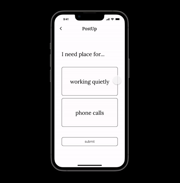
When I asked my participants to set up the preferences setting, they had some difficulties. They did not know how this screen works, and they wish to have more options. Instead of ranking the preferences, I decided to use tags for the preference setting, because people tend to know what they like and dislike compared to ranking their favorites.

Yes/No/Bookmark
Before, I was trying to have a Yes/No straightforward decision as Tinder does, but after the user testing, people would love to have more options, aka having a backup, as if in Tinder, have chances to find the best one. So I created a new bookmark feature; users can now compare more than two places by adding places into bookmarks.
Final Prototype
Final Thoughts + Future Steps
Challenging but inspiring!
During this process, I have two main takeaways:
1. write down everything, your thoughts, questions, or sketch! I love the spontaneous moment when I have ideas pop into my mind when I did the lightning demo.
2. working under a timeline is challenging but a good experience of following the instruction and guiding the project! Although the problem is given, I tried my best to input my creativity into this project by thinking out of the box!
If I had more time, I wish I could:
1. conduct more interviews by myself, asking questions related to the preference of the place to work
2. create icons that can symbolize the tags, which may help the user make the decision quicker
3. do a secondary research finding on how people make decision and how might I create a design based on the research